If you want to go straight to the interactive maps, here they are: Population vs median income and PCA & k-neighbors. If you’re reading this on a mobile device, in their current state these maps work a lot better on desktop.
One of the nice things about visualizing data in maps is it comes with familiarity. With a graph, you might not know where you fit in, but with a map you can see where you are in the dataset.
Usually you see data mapped with a choropleth map. A US county choropleth map might look the image below.
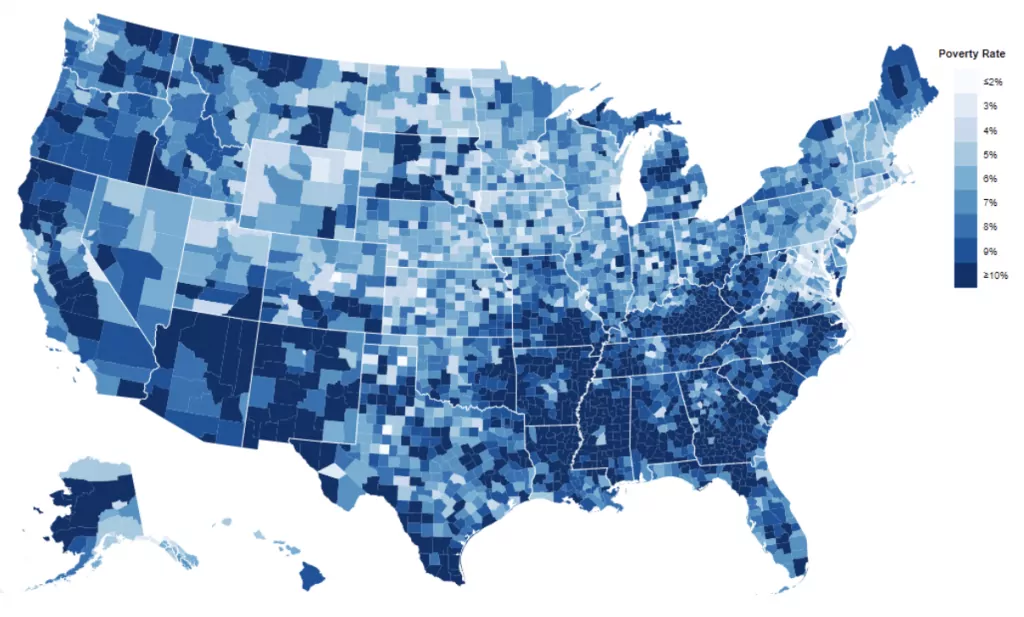
This method is great for finding regional patterns in a one dimensional dataset. It highlights the upper and lower extremes, but it can be hard to tell the differences among the middle buckets.
A closer comparison with other places is valuable because you can apply the familiarity you have with your own area to other places.
By mapping the k-neighbors for each county, you can find which counties are most similar to each other in the dataset, without giving up the useful context that maps provide.
The scatter plot below shows US counties by population and median income. Hover or tap on the circles to see which county they represent:
The closest neighbor to Los Angeles County California is Cook County Illinois, followed by Harris County Texas. All three contain massive cities (LA, Chicago, and Houston, respectively) so it makes sense that they are near each other in the graph above.
To turn this into a map, I scaled the above data and ran a k-neighbors model to get the nearest neighbors for each county. I used that data to create this interactive county map, where you can click the counties to see their nearest 50 neighbors in terms of population and median income. When you click a county its neighbors in the dataset are highlighted.
This kind of map gives a bottom up view, as opposed the to the top down view a choropleth map provides. It highlights places relative to each other, rather than the entire dataset at once. You could use a scatter plot like the one above, but a map provides the context of physical space.
Use Cases
This kind of data can inform decisions. With remote work becoming the standard in many fields, some people are thinking about relocating. If you like your current location, you might find this kind of map useful for finding similar places.
Another application could be for a marketing or political campaign. If certain messaging had a positive effect in one county, you might want to see which counties cluster with that one demographically when choosing the next ad buy.
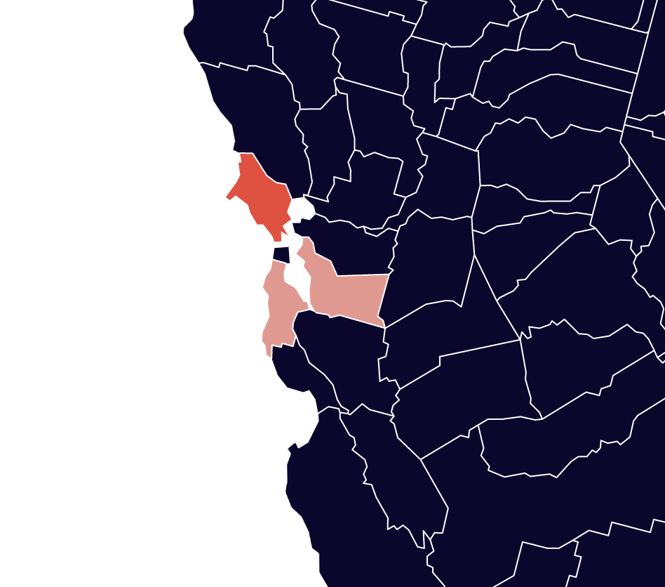
Marin County and North Slope Borough
Marin County, California is an affluent area on the San Francisco Bay. If you select it on the map above, the nearest neighbors include other affluent counties with mid-size populations, like the well-to-do suburbs of Northern Virginia, New Jersey, and Connecticut.
But so does North Slope Borough, Alaska. On the far northern edge of the state, it isn’t what you think of when you think of Marin County.
It turns out that there aren’t many people in North Slope Borough, but a relatively high number of them work in oil and gas extraction, so the median income is comparable to that of the bay area and Northern Virginia.
This shows that using only two variables leaves plenty of room for outliers to mess up the results. I could add election data as third variable, but for the purpose of demonstration lets see what happens if I add not just one but six more variables.
The next map includes population and median income like the first map, but I’ve added:
- Gini Index (a measure of income inequality)
- Percent of population that lived in the same area last year
- Percent of population currently in an undergraduate college
- Percent of population that has a Master’s degree
- Percent of population in the military
- Percent of voters that voted Republican in 2020 general election
I’m only using those data points to show that this technique works with whatever you want to throw at it. After reducing those 8 columns down to 3 using principle component analysis, I ran k-neighbors over the resulting values.
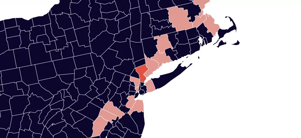
This results in a different and perhaps better grouped k-neighbors county map. I also reduced the nearest neighbors from fifty to ten, but even with fifty, North Slope Borough was no longer included in Marin County’s set of neighbors.
Now when you select Marin County, you see other counties around San Francisco (pictured above), as well as the counties outside of New York City, Boston, DC, and Detroit.
If you select Cumberland County North Carolina, you see the other counties with a high percentage of people in the military. And if you select Oktibbeha County Mississippi, the other counties with a high percentage of college undergrads are highlighted.
Again, I’m using somewhat random data points just to show how it works, so they won’t correlate as much as a dataset that is more focused on a single topic. In fact, only 61.5% of the original dataset’s variance was maintained across the 3 dimensions in my PCA model, which is at the lower end of what I would use for something like this.
In real life you would probably use a more correlated dataset, for example if you were looking for similarities using only health or economic data. In those cases you can most likely retain more of the variance of the original set.
You can take a dataset to a relatively abstract space and bring it back to something more concrete by mapping it.
About the Data
Most of the data I used for this is from the US Census Bureau’s American Community Survey 5 Year dataset, which is ideal if your research includes geographies with smaller populations, as many US counties do.
For election data, I used the MIT Elections Dataset. One issue I ran into here is that Alaska does not count votes by county, so it is not possible to get the exact figure at the county level. I used K-nearest neighbors on the rest of the dataset to impute the percentage of Republican voters in each Alaskan county.
Here is the raw data if anyone is interested: US county k-neighbors map data.
Other tools I used for this include:
- Scikit-learn for k-neighbors, PCA, and KNN imputation
- D3.js for the two maps and scatter plot
- Jupyter, Pandas, and Numpy for working with data